case study:
Patina restaurant group
Branding a new corporate entity
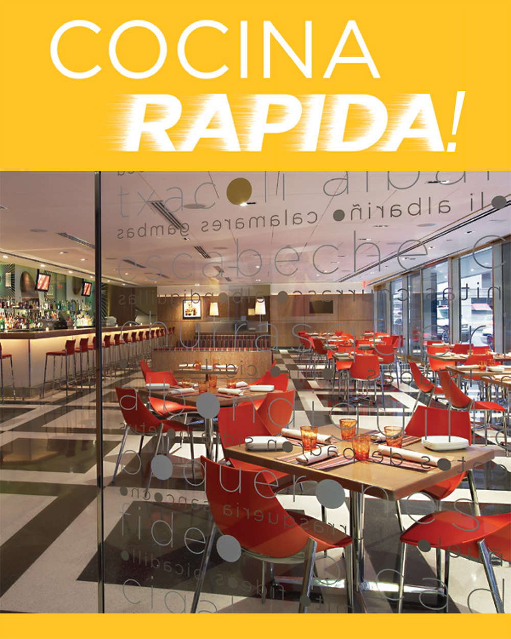
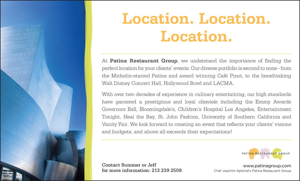
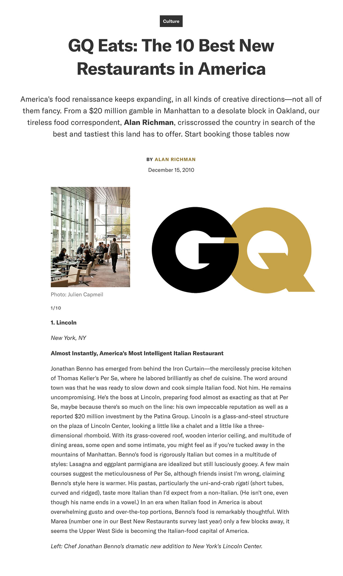
When Patina Restaurant Group (PRG) split from Restaurant Associates, its branding was a dissonant mashup of East Coast and West Coast styles and sensibilities. Food Dine Wine Marketing masterminded a complete corporate rebranding whose objective was to align both “factions” seamlessly with a refreshed, unified brand voice and aesthetic.
WHEN TWO WORLDS COLLIDE
The logo – see below – was old-fashioned, corporate, and unequivocally generic. Far from communicating “food,” “deliciousness,” and “hospitality,” it could just as easily have been the uninspired emblem of a widget or siding company.
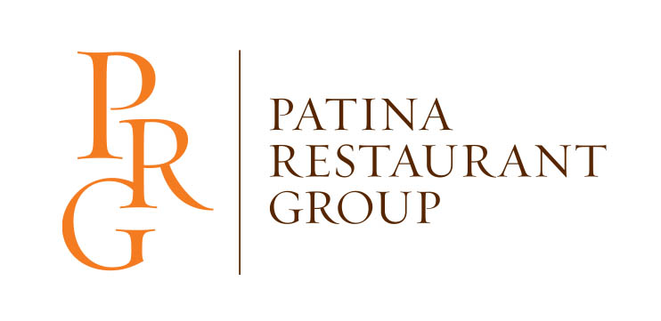
FDW, alongside a top branding agency, conducted exhaustive exploratory research from which a new brand identity was born. This arguably unified PRG’s 60+ distinct concepts (encompassing upscale restaurants, bars, QSR, and catering services in prominent cultural centers nationwide) and emphasized a refreshed, inspirational “food-forward” aesthetic:
• “Food Is Art”
• Modern, 21 st C. appeal
• Chef-driven
• Clean, uncluttered
• Upscale
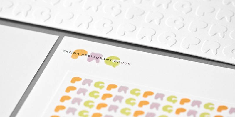
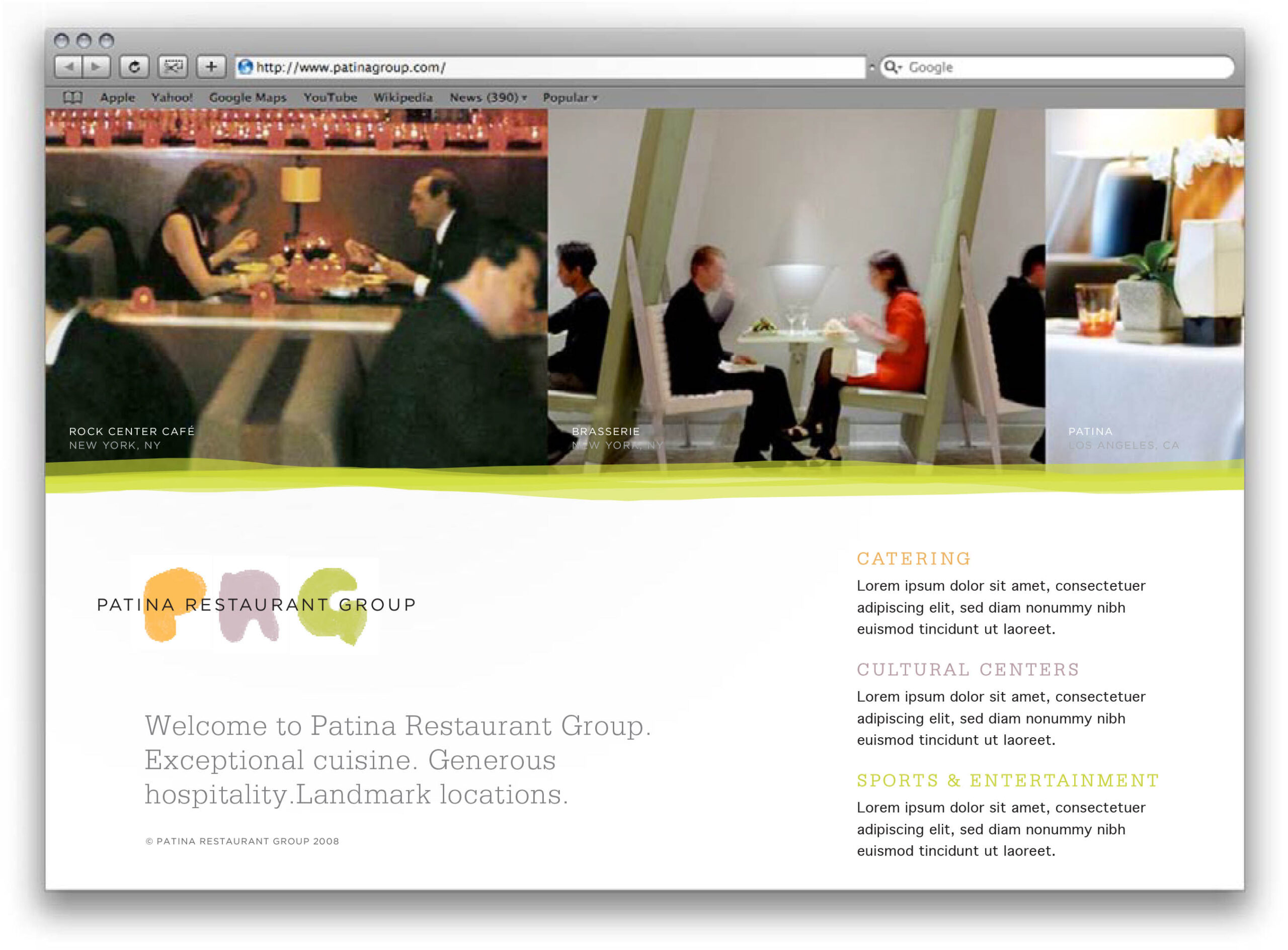
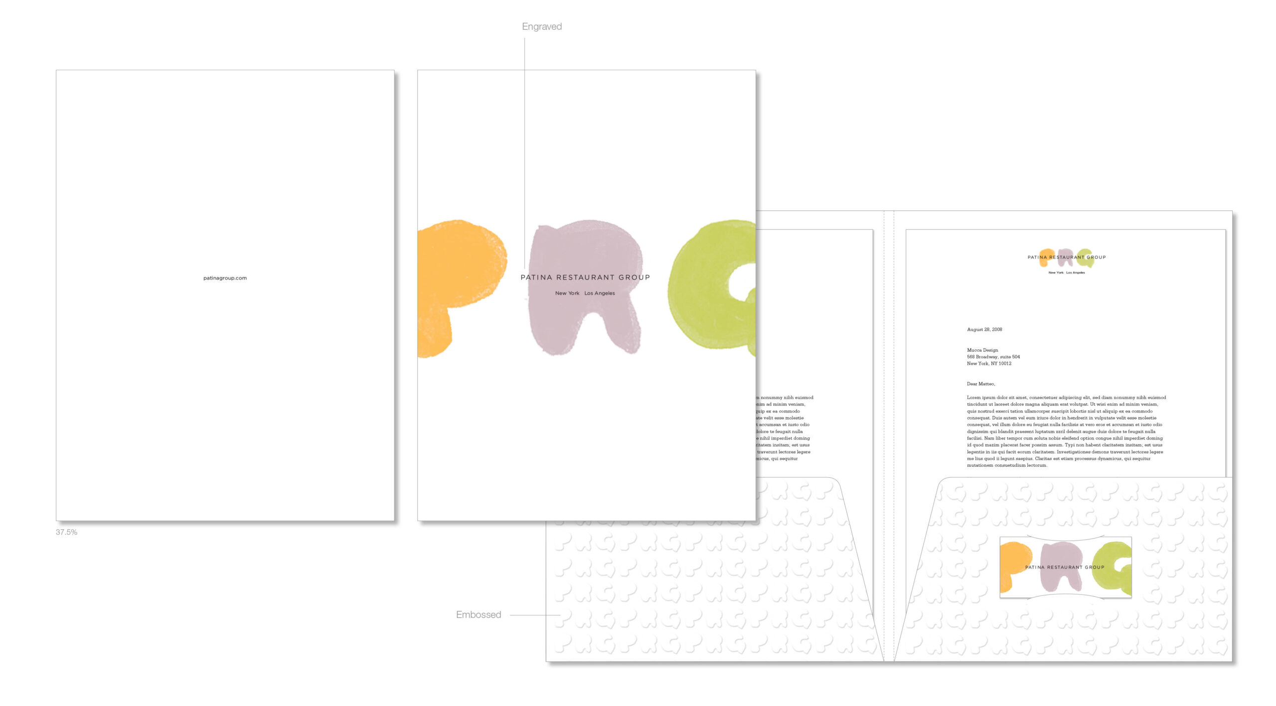
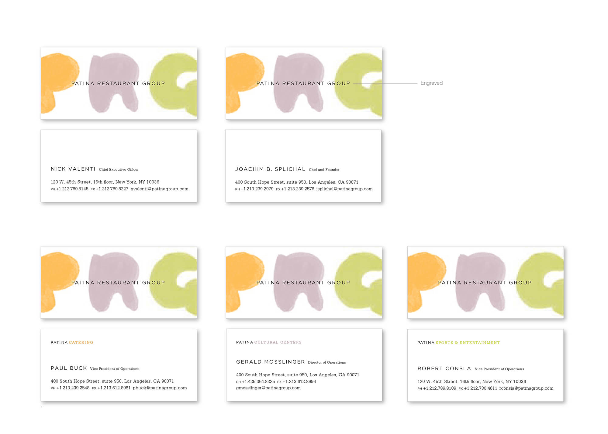
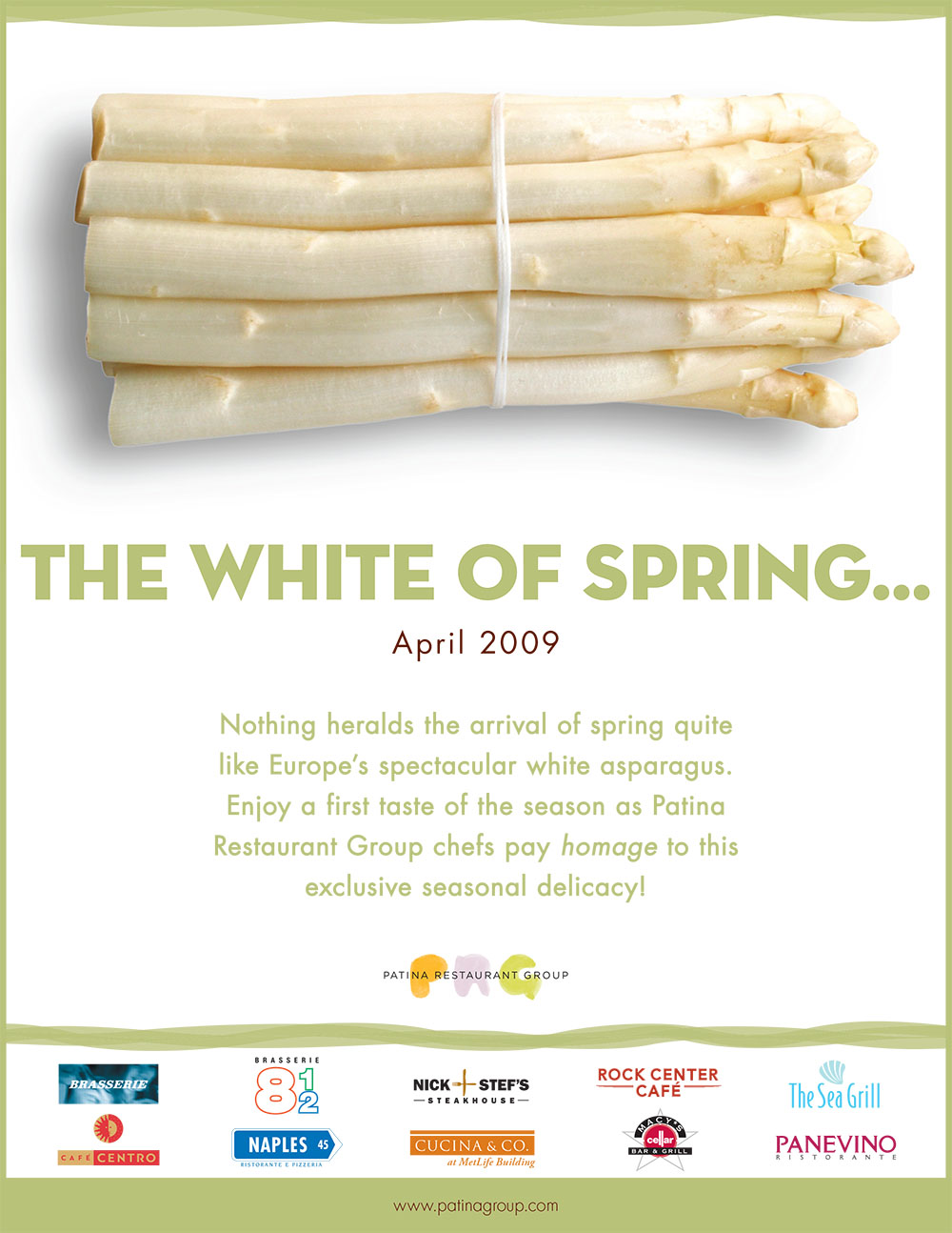
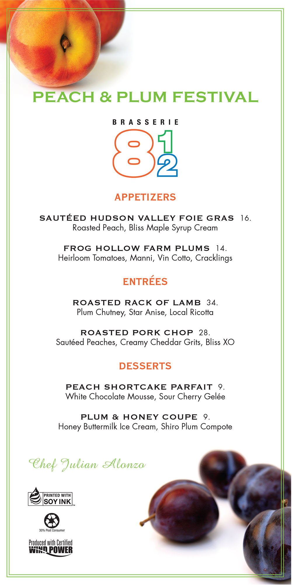
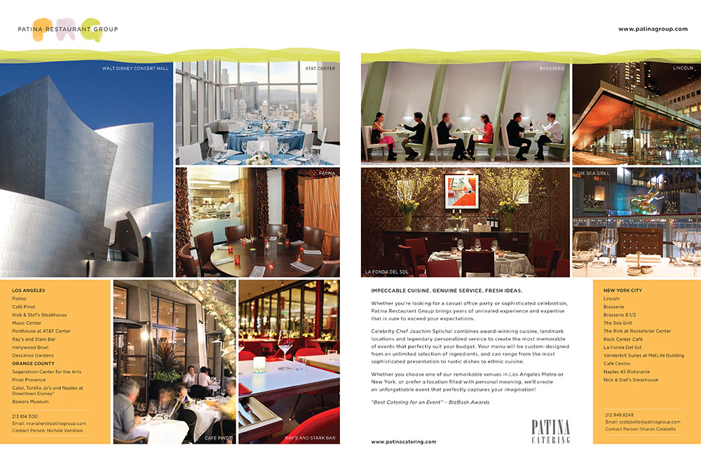
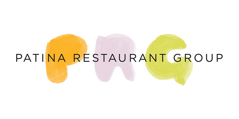
The logo mark was inspired by the image of Joachim Splichal, the company’s celebrity chef and co-owner, drawing with his index finger the letters P, R, and G in carrot, eggplant, and spring pea purées, respectively – thereby underscoring PRG’s new artisanal, chef-driven focus. The resulting brand architecture was applied across all consumer-facing platforms such as the website, all marketing materials (traditional and digital), business cards, stationery, gift cards, e-blast template, packaging, chef coats, delivery trucks, company brochure, and digital/traditional advertising.
Testament to the simple beauty, timelessness, and proprietary nature of PRG’s logo mark is that it is still in use today.
MISCELLANEOUS
Website
Press Kits
Business Cards
Newsletter
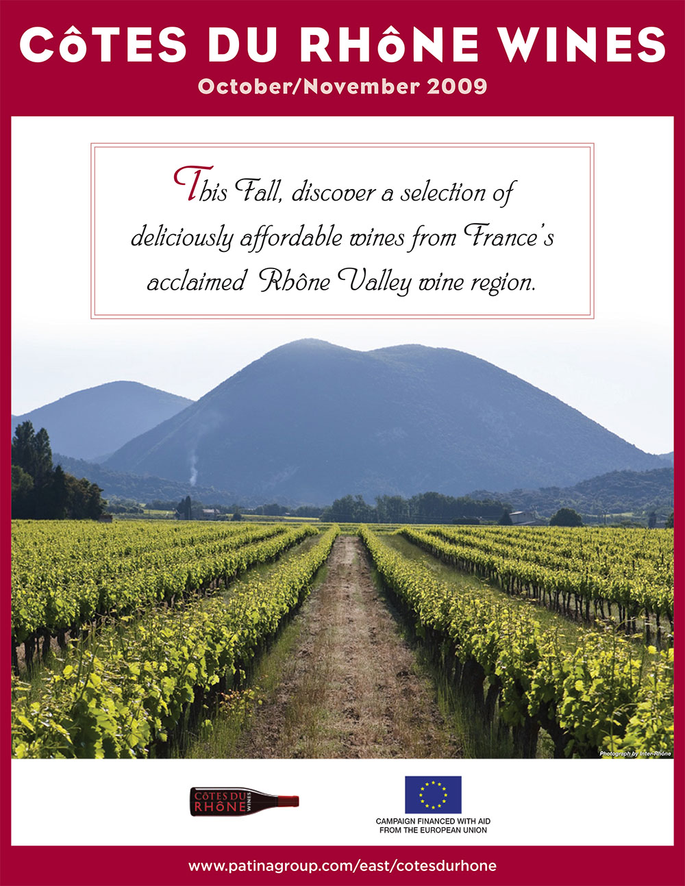
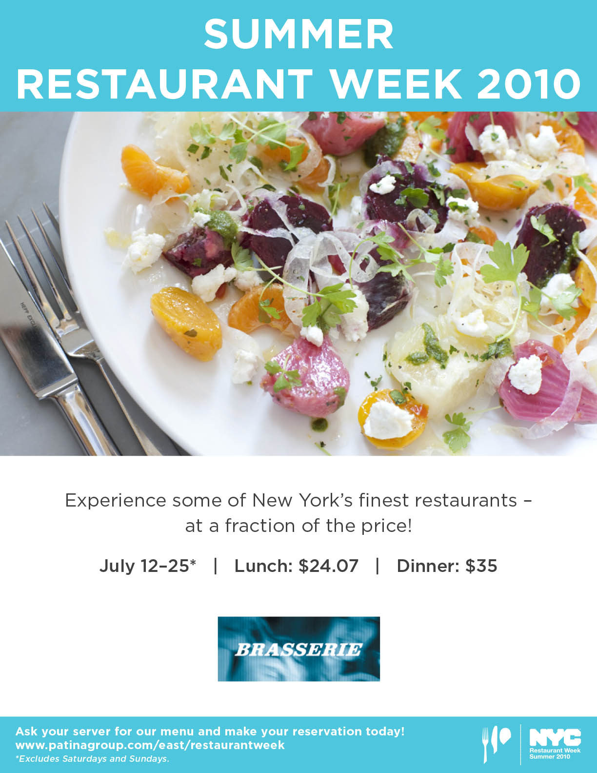
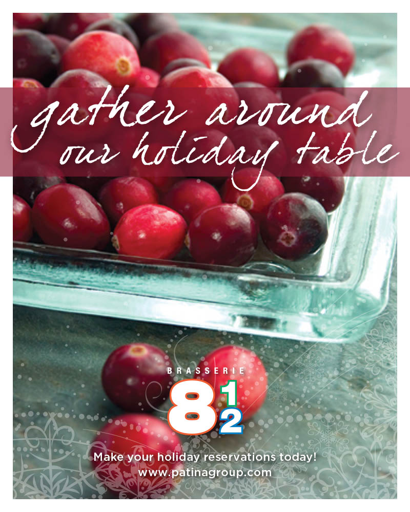
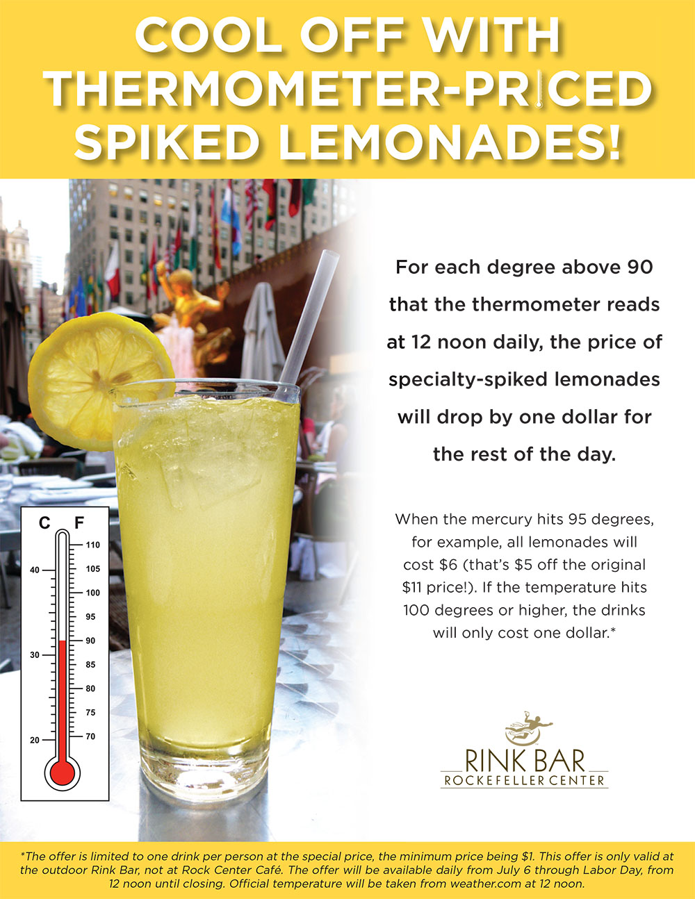
Partnership Marketing
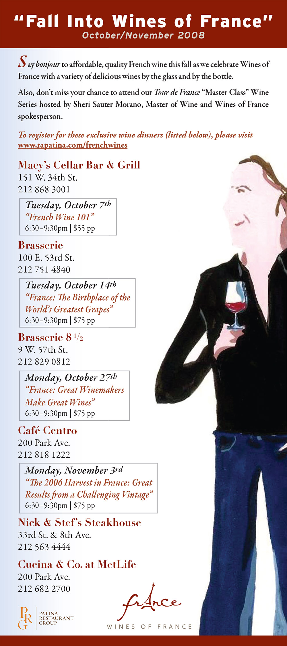
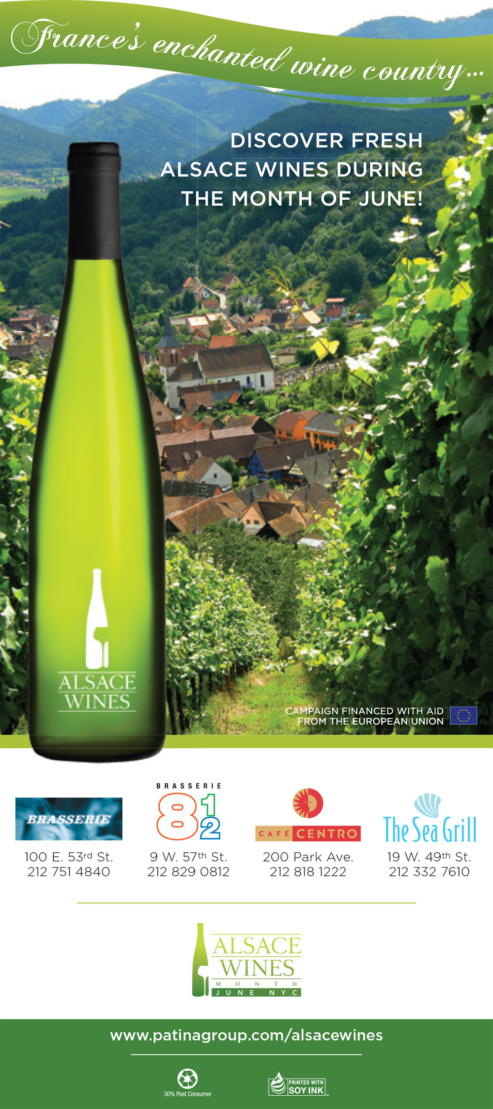
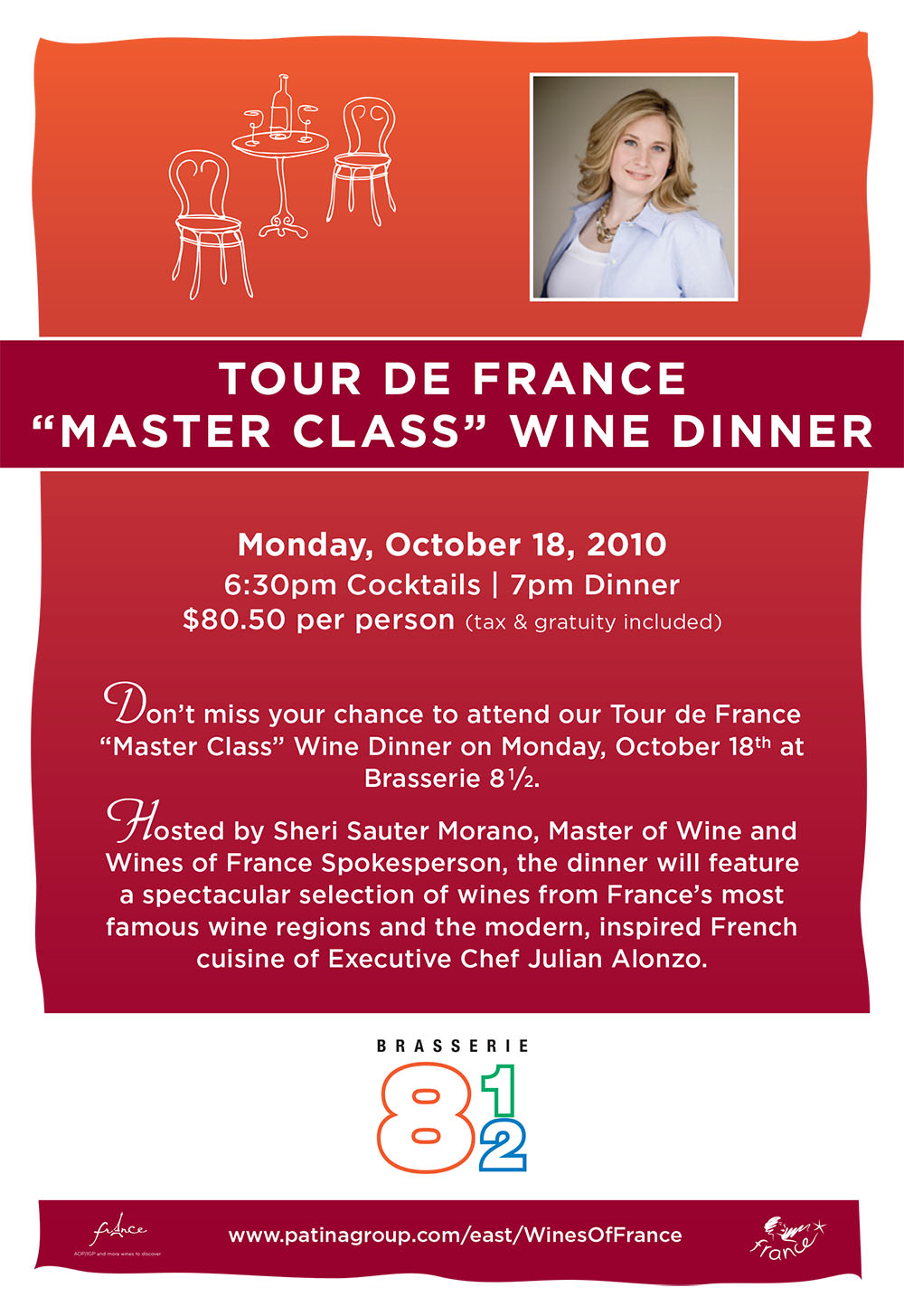
Food & Wine Promotions
